The Rackhouse
Services
BRANDING • COLLATERAL • GRAPHIC DESIGN
Branding for a Rustic, Scratch Kitchen
The Rackhouse is a family-friendly scratch kitchen with Texas flare. With stunning sunset views, a huge selection of whiskeys and scotches, a family-friendly atmosphere, and live music, The Rackhouse is a great gathering place for patrons of all ages.
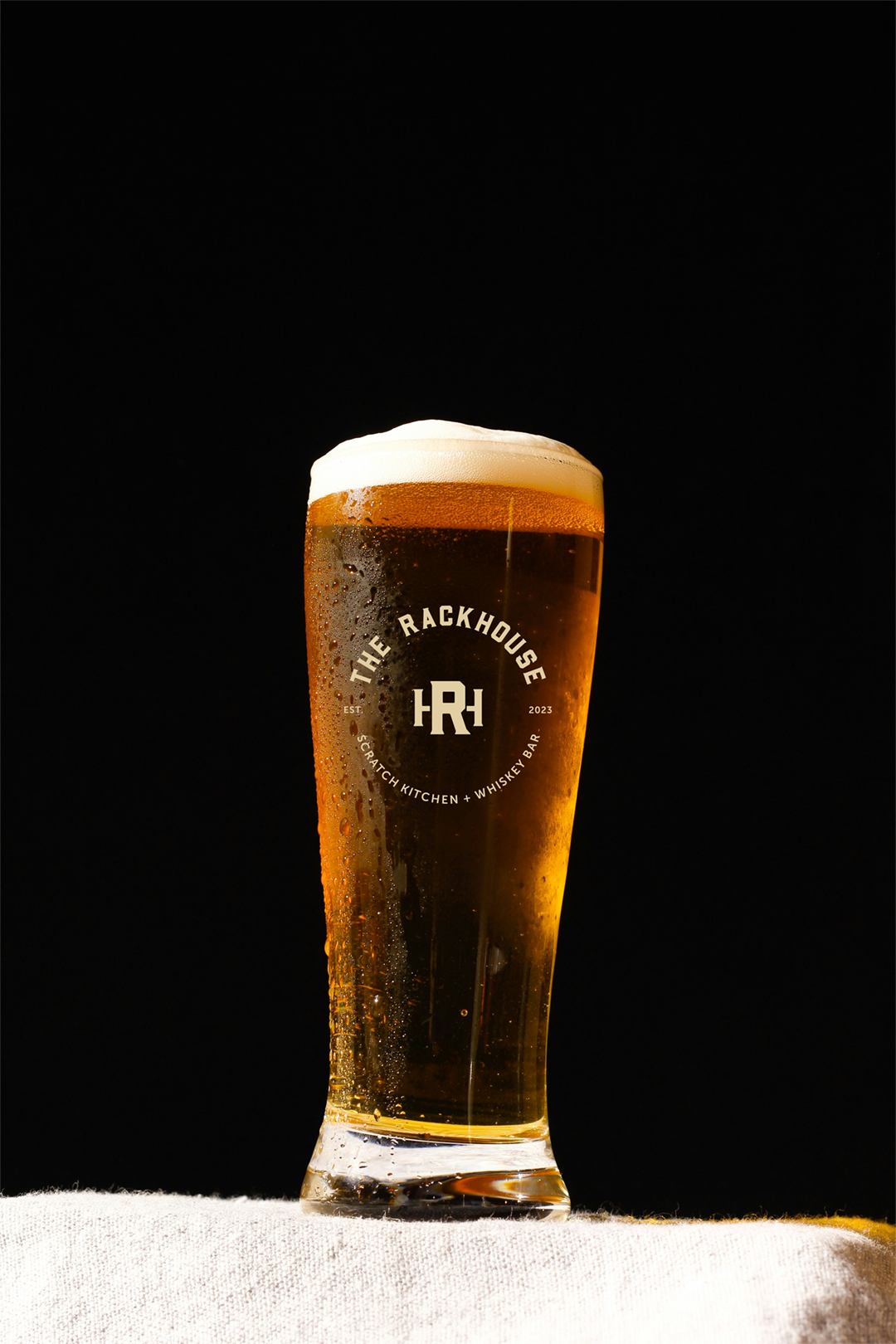
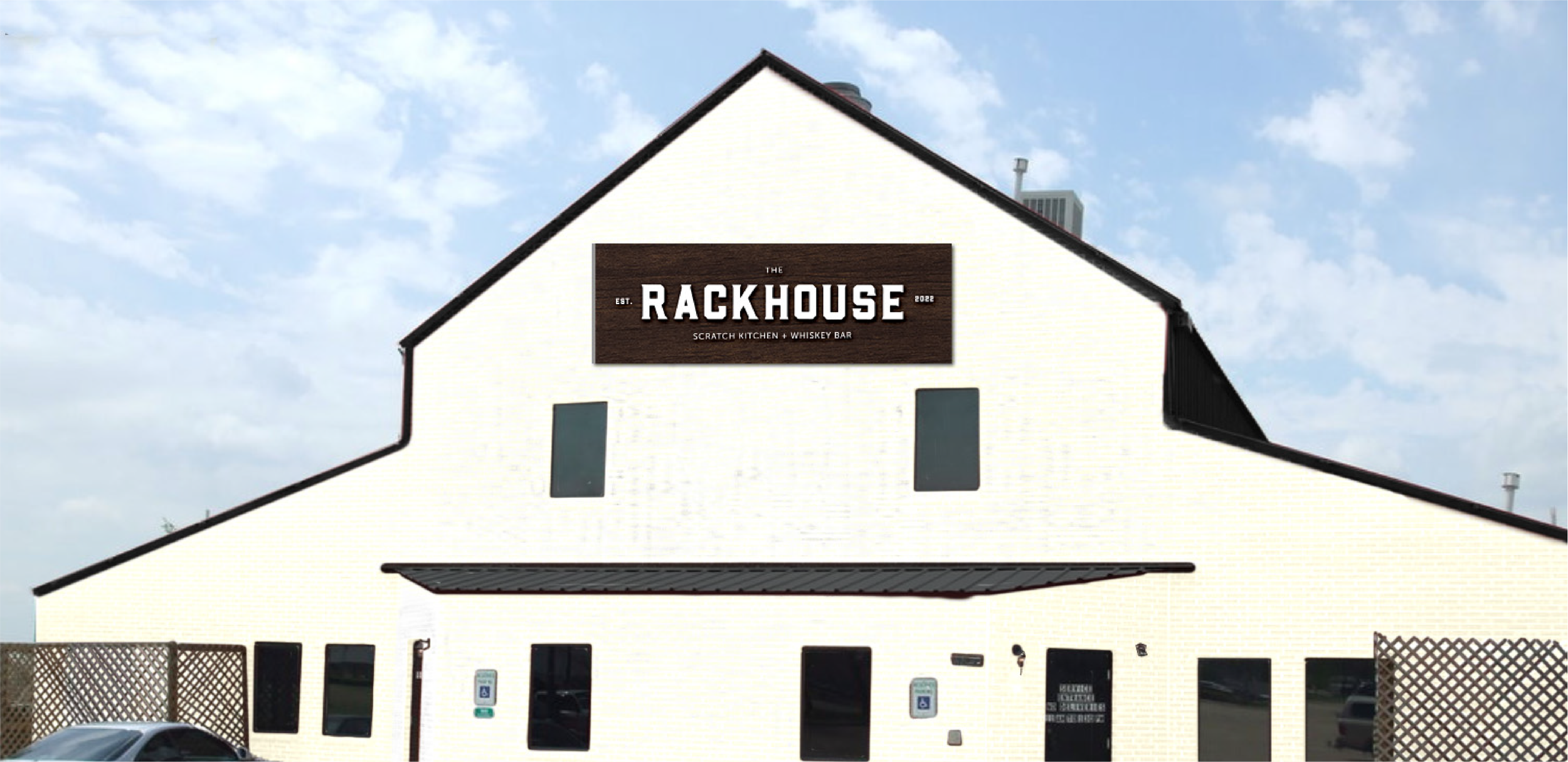
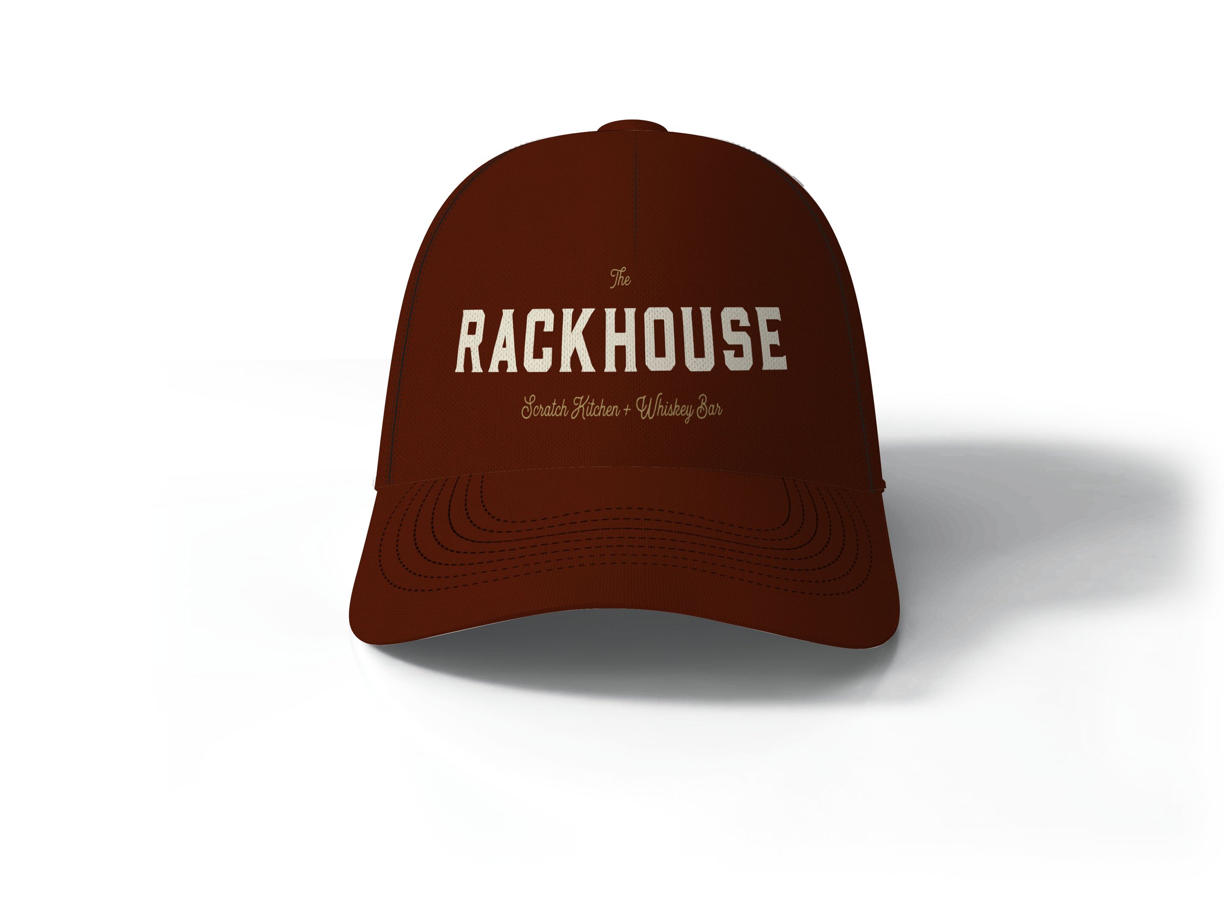
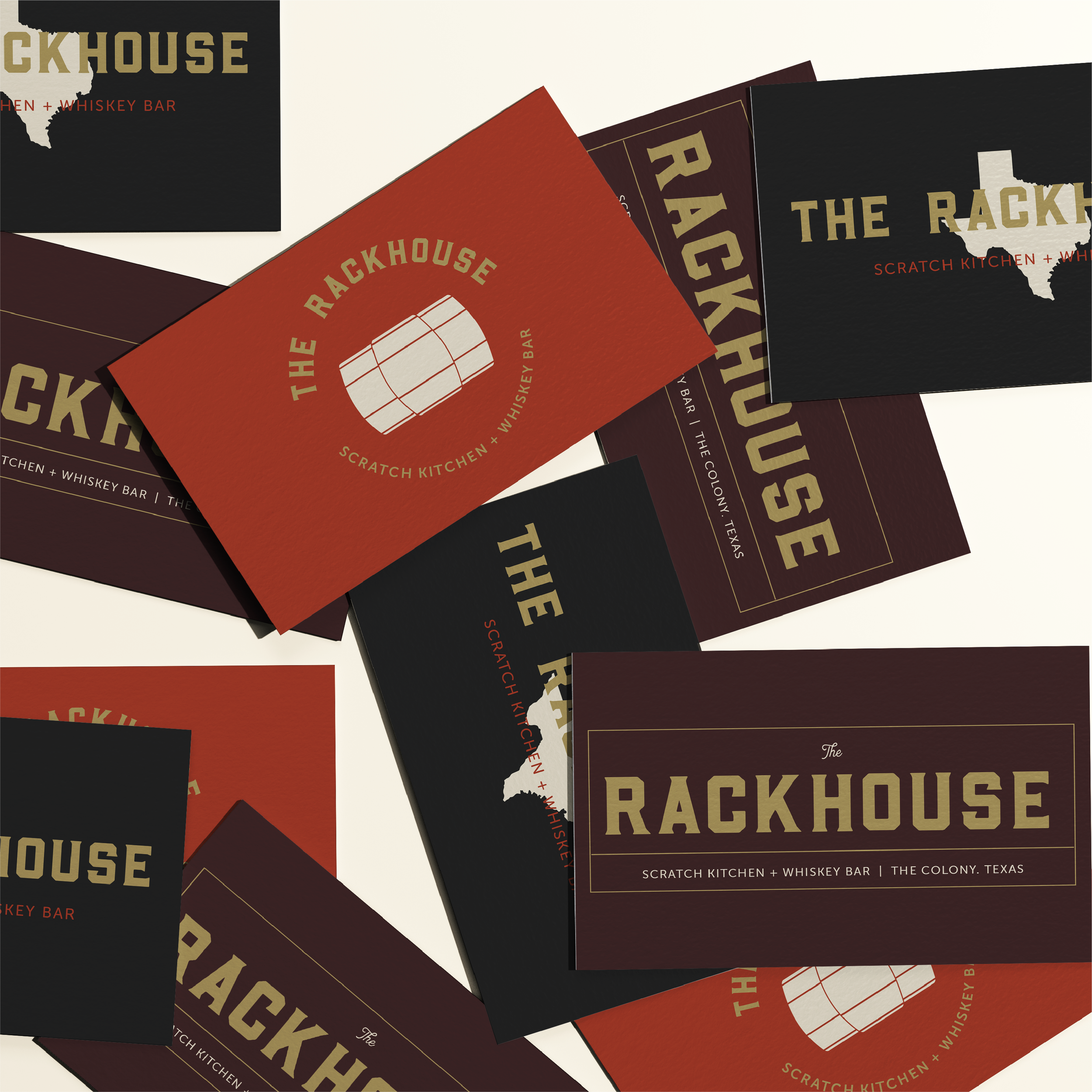
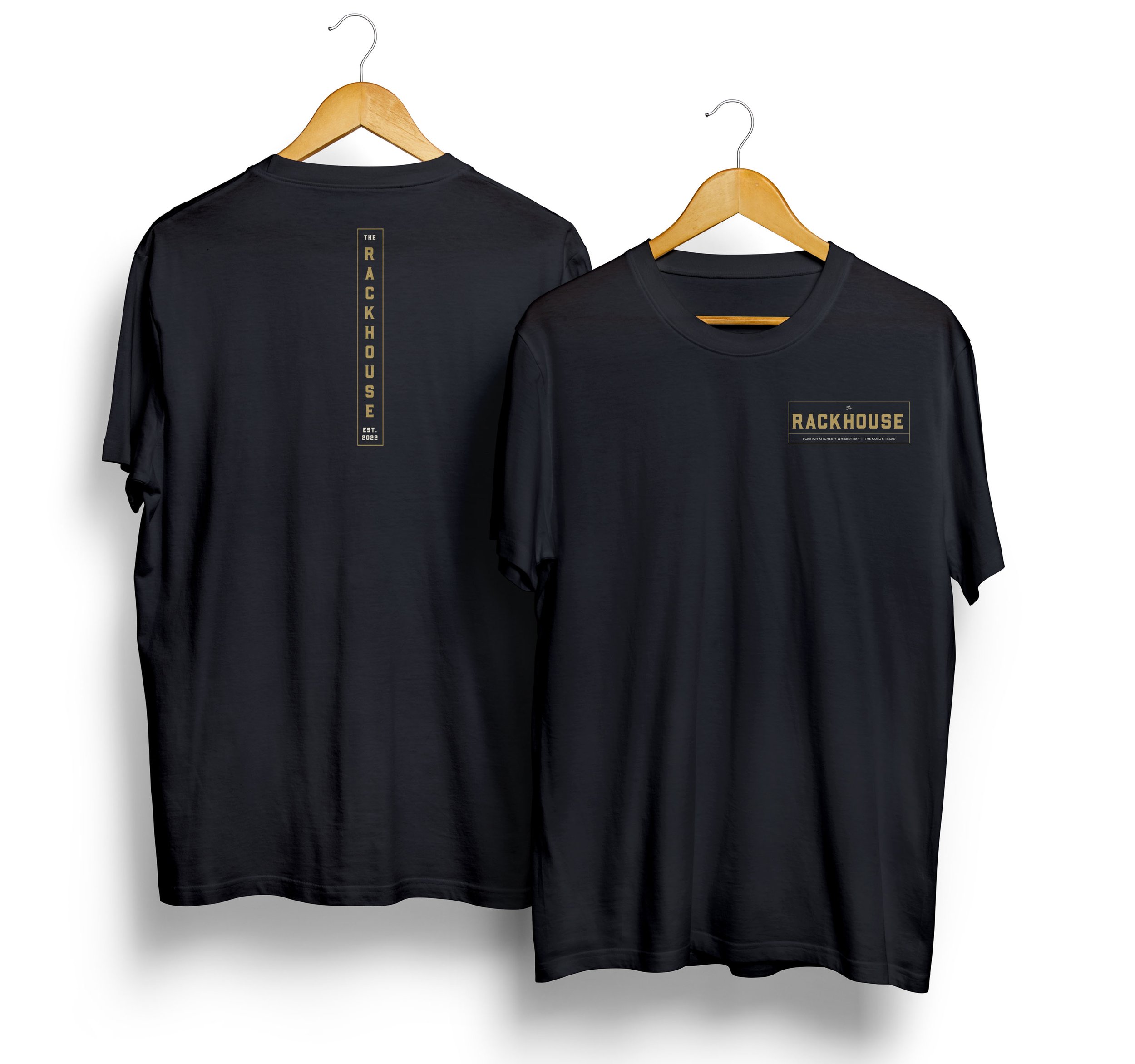
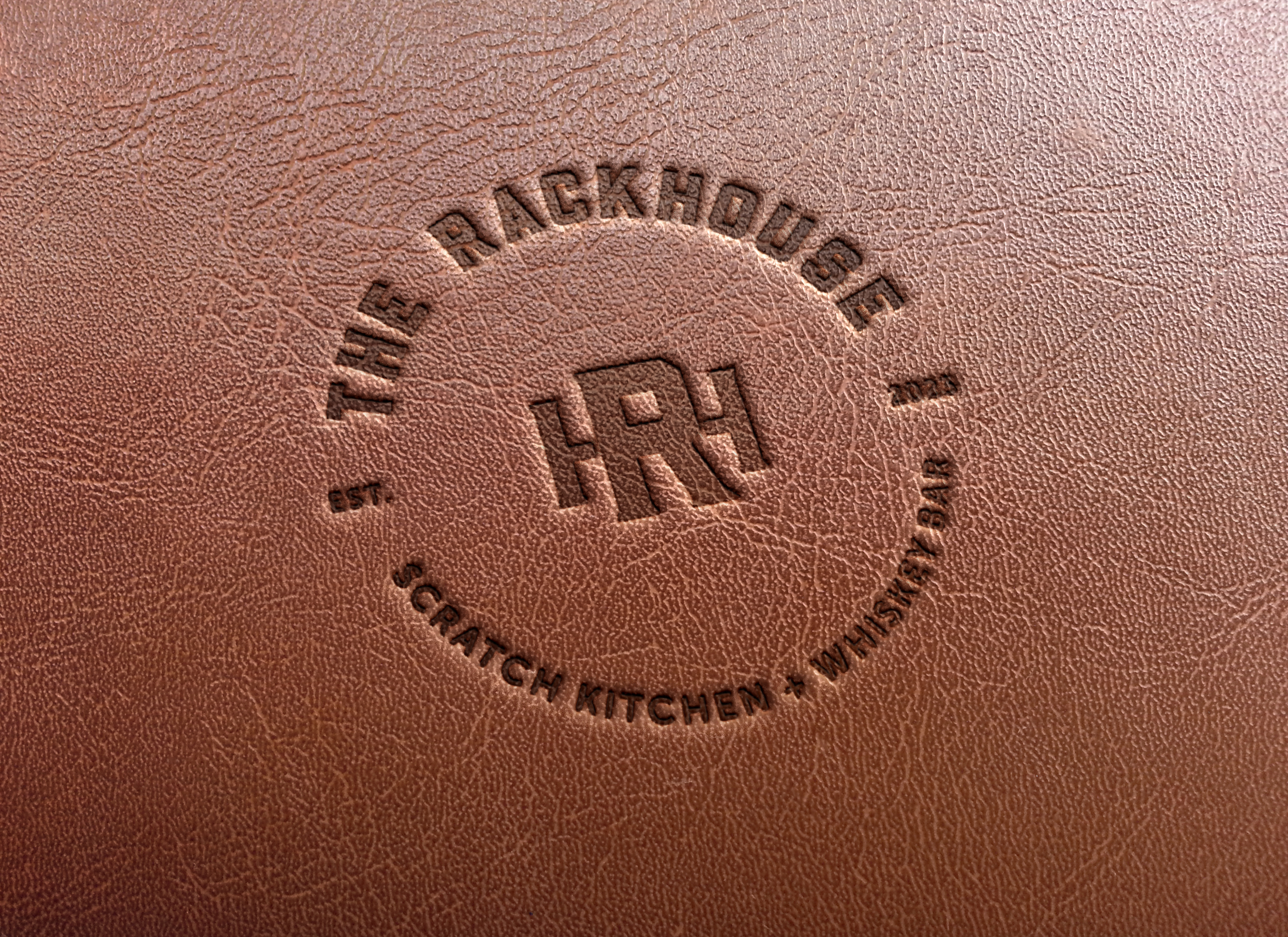
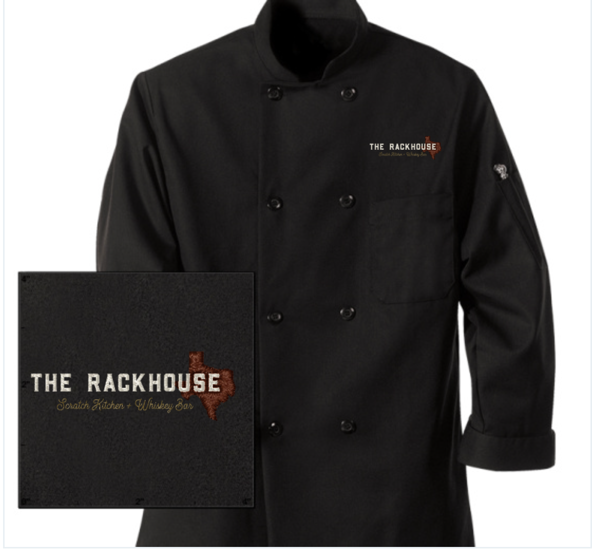
The Rackhouse offers a rustic, yet friendly atmosphere that needed branding to match. The main font is eye-catching and decorative while the sans serif font is rugged and bold giving this brand a gritty, beautiful combination. The brand embraces the old whiskey-bottle design style, by featuring multiple fonts and displays in big vignettes. The icons for The Rackhouse pay homage to their Texas tradition, the whiskey barrels that are aged in a rackhouse, and use their name to create a succinct and easily identifiable monogram. All these pieces come together to create a complete brand that speaks to The Rackhouse’s rustic, yet friendly concept.


