The Top 5 Mistakes Your Website is Making
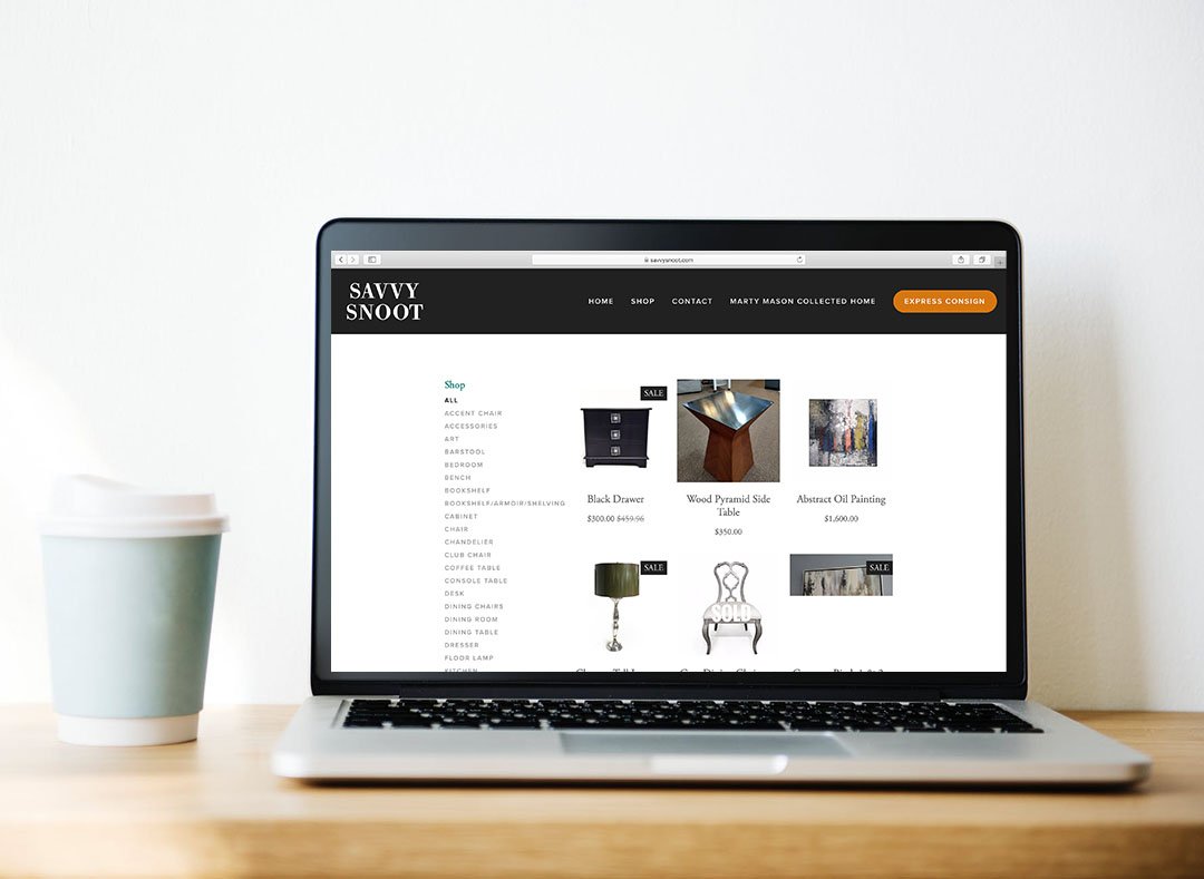
Foreword: We keep all of these things in mind when we build sites. Check out Savvy Snoot as an example.
Your website is at the core of your digital presence. No matter the route it took to get there, be it through social media or a Google search, all roads will lead back to your website. It is the ultimate landing page for all things related to your biz—the who, what, where, why, and how. It’s time to make sure it is meaningful and effective.
We can talk tech specs (because we know those too), like making sure your site loads fast, that it will pull up on an iPhone, or that it’s secure. But your user experience should be walking down the aisle hand-in-hand with your website’s design principles and content. Since we’re design humans and storytellers, we’re going to walk you through our philosophies on what makes a good website.
“Photos. Big, sexy photos.”
We process visuals 60,000 times faster than text, with 90% of what gets transmitted to the brain being visual. Everyone likes to see what they’re getting before they get it. If you are a restaurant, show us some of your tastiest dishes. If you are an apartment community, let’s see your happiest smiling residents. No matter the industry, you need imagery on your site to showcase what your business represents. It is also important to note that choosing the right type of photo matters too. We don’t want to see any off-brand images or graphics.
“Web navigation is no place for cute.”
Keep your site navigation simple and direct. Don’t confuse your audience with terminology you think is cute. Typically when someone reaches your site, they have a purpose for being there. Maybe they just want to see your hours or try to gather more information on what you’re about. Whatever the case, make it easy for them to find what they’re looking for. You don’t want to create any reason for them to leave. This would be like if we named our blog “The Nest” in our navigation bar. Although cute in theory, it isn’t clear where it would lead you.
“No outdated content. Just no.”
Ever heard the phrase “content is king”? Well, up-to-date content is the true ruler of the kingdom. Your website is your living, breathing virtual document that you will have to revisit regularly to not only make sure things are running smoothly on the techie side, but to make sure your information is current. Are you showcasing an item you don’t sell anymore? Have your hours changed? These are things to be mindful of to not create any potential friction between you and your audience.
“Bullet points by any means necessary.”
Prepare for users to not read your content word for word. People enjoy bite-sized information. Use bullet points to highlight the key takeaways of your message. It’s easier to digest and will prove to be way more user-friendly than any essay you would have written. Make defined headings and notate the good stuff. It’ll be easier on the eye and much easier to lead site visitors to your point.
“Put your best foot forward with your contact information.”
This last one is a doozy. More than half of your website traffic will be to find your contact information, so of course it deserves its own navigation page at the top. But, one of the goals of your website is to have people explore and take a look around at your different pages. What happens when a user ends up really digging one of your blog posts and ends up all the way at the bottom of your site? Are you going to make them scroll all the way back up to the top of your site to get your info? No. You’re going to put your contact information in your footer too. Make it easy.


