Fonts For Feelings

And now for the real title…
Typeface for Feelings*
*We affectionately titled this blog Fonts for Feelings, but we can’t let our need for cute mess with proper terminology. The correct term would be typeface. Typeface is the “what”, the visual representation of what you see, and fonts are the “how” (think: bold, italic, 12 point).
All meaningful brands have been built on emotion. Think of your brand as a living breathing human with a personality. How would this person act? Are they happy and welcoming? Or do they mean business and act with dignity and professionalism?
When you set out on your journey to define your brand and determine how you would like to make your audience feel, it all begins with creating your brand’s visual identity.
For us that means:
Choosing your typeface
Determining your brand colors
Designing your logo
Let’s look at some popular brand emotions and how to select the appropriate typeface.
Happiness
Naturally, many brands would like to put their customers in a feel-good mood. They want to have smiling, happy faces associated with their brand and provide an experience that produces just that.
Our Picks
Aurora

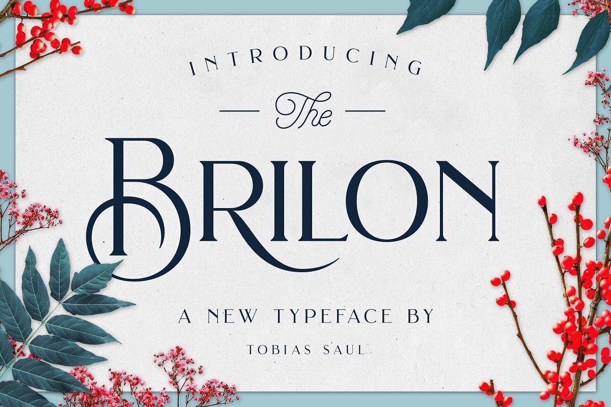
Brilon
A hand-rendered san serif
When a logo is completely hand rendered, that gives it a more personal touch. This makes your brand seem more down-to-earth and humanistic, thus making it a happy one.
Here are some logos of our happy brands:


***Color Theory Bonus: Yellow is the supreme color of happiness.
Nostalgic
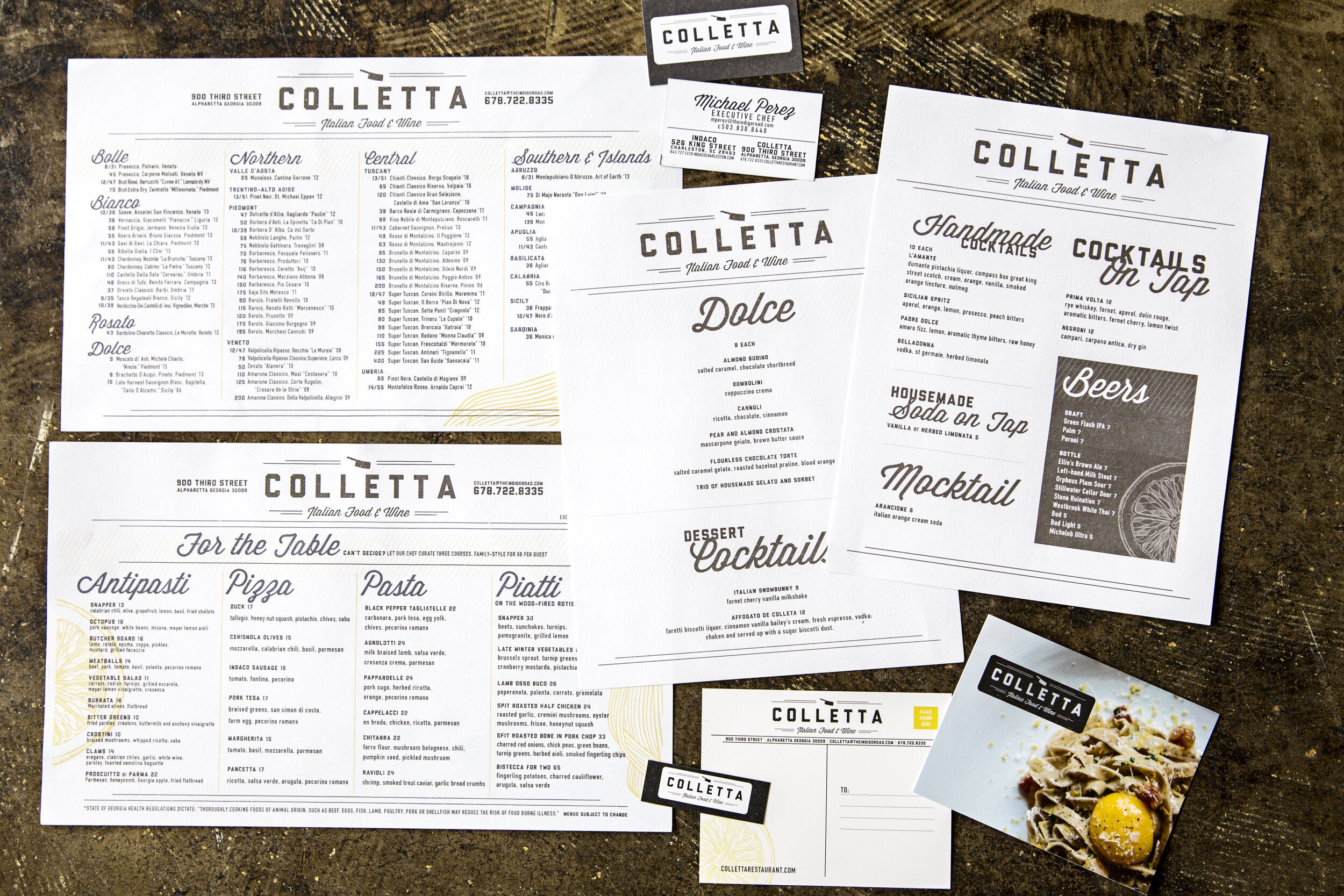
When choosing an appropriate typeface to drum up fond memories of the past, we like to look at specific time periods. We study it, check out old signage and use that as inspiration to capture the emotion our client is seeking to convey.
Our Picks
Lobster

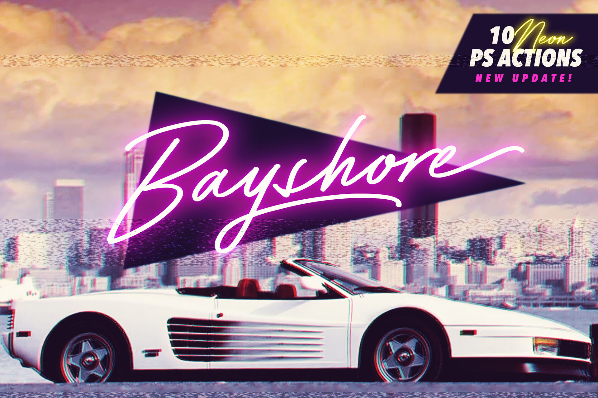
Bayshore
Voyage

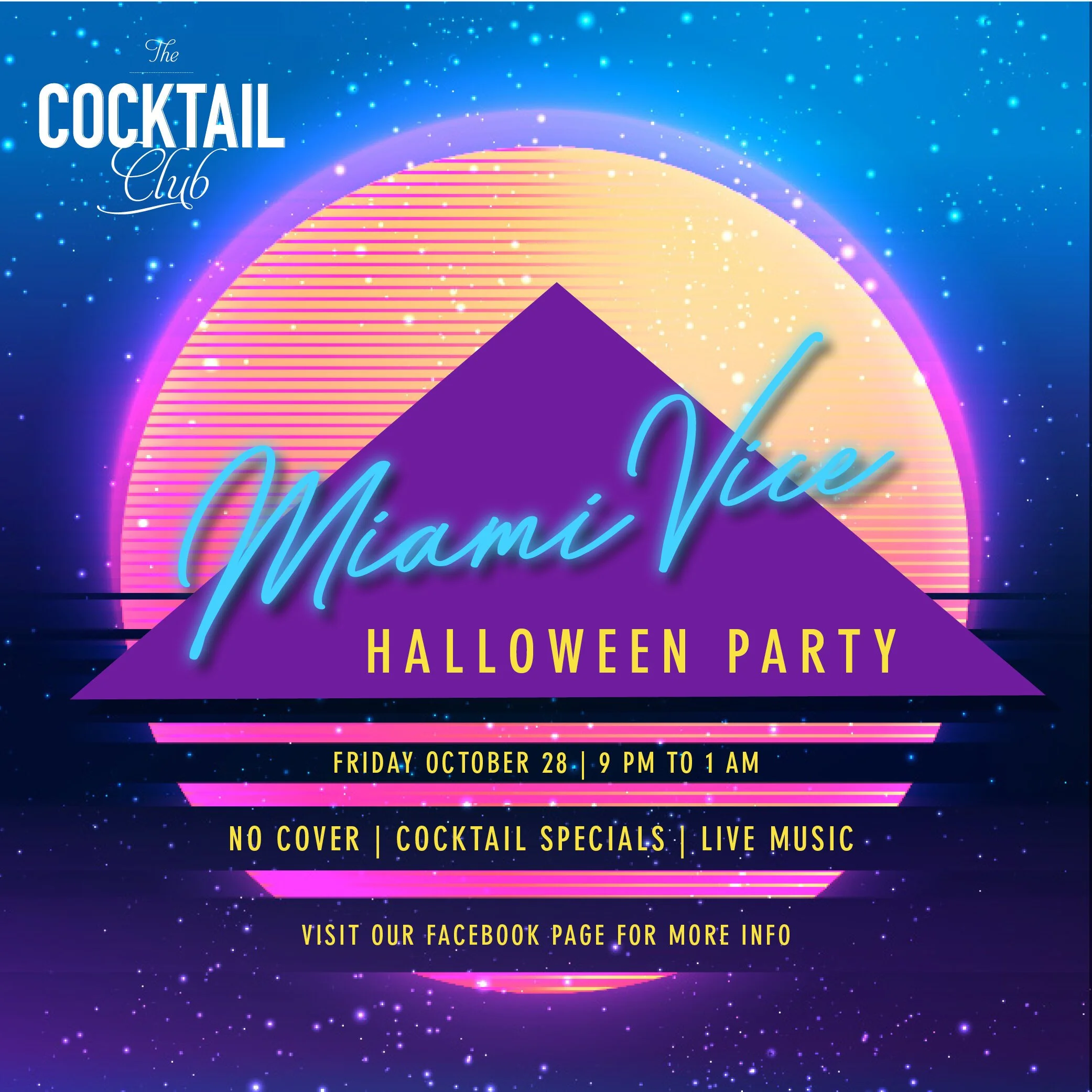
Here are some of our examples:
***Color Theory Bonus: Purple is the color of nostalgia.
Sophistication
For those that want to exude the utmost sophistication, we automatically think refined, classic, and luxury. We tend to go for typefaces that will add a touch of elegance.
Our Picks
Mrs. Eaves

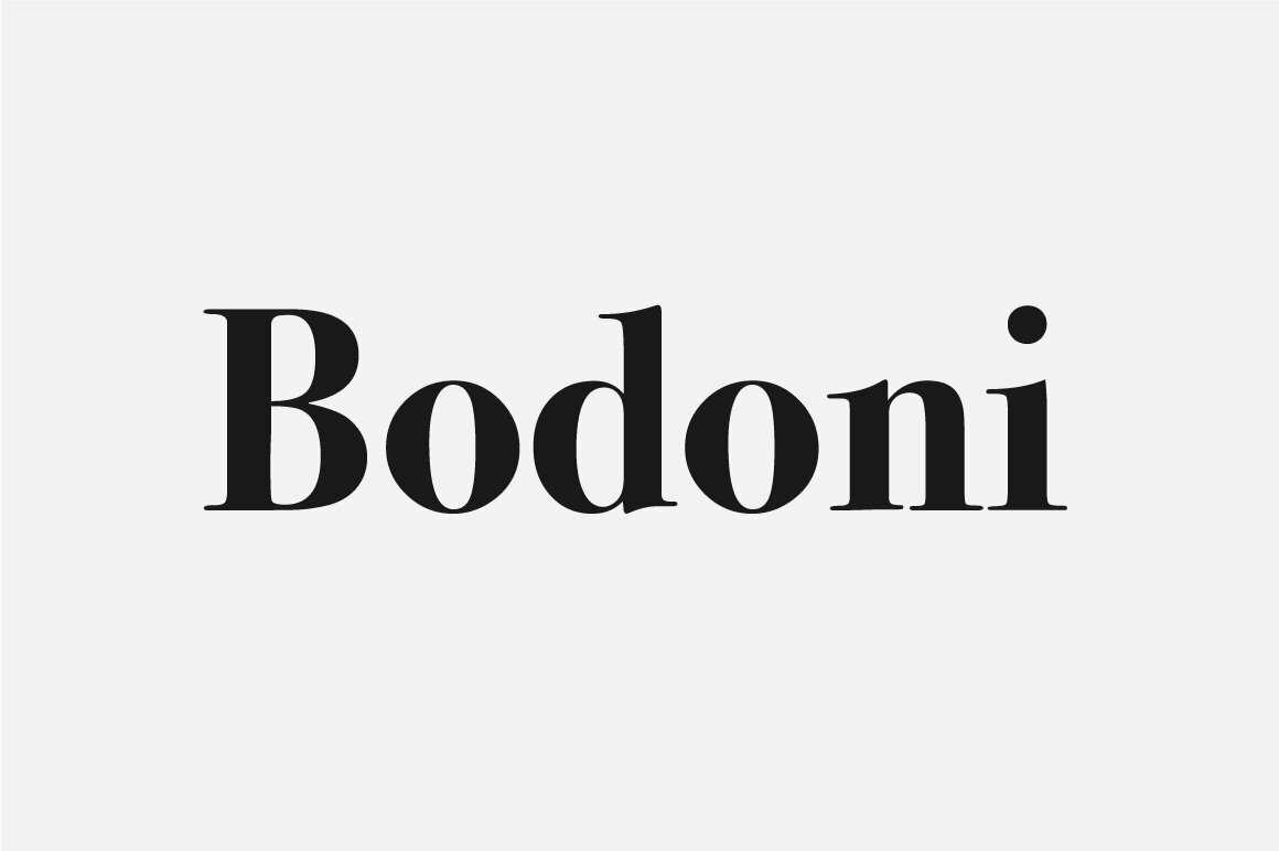
Bodoni
Din Spaced Out

Our examples:


***Color Theory Bonus: Try a pale peach for a sophisticated feel.
Strong
Strong brands are bold and command attention. Their expectations are clear and they set them from the very beginning with its design.
Our Picks
Bebas Neue

Helvetica

Futura

Some of our client work for strong brands:
***Color Theory Bonus: Blood red is a strong color choice.
Professional
Professional brands set out to effectively communicate their brand promise and overdeliver on it. Their main focus is making sure they are acting in a reliable and competent manner and making sure their audience trusts their expertise.
Our Picks
Gotham
(Super popular with politicians)

Baskerville


Our examples:


***Color Theory Bonus: Navy blue is the ultimate color of professionalism.
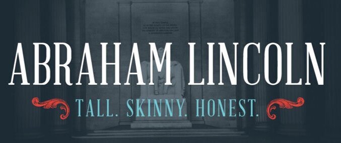
Inviting
Inviting brands provide a warm and welcoming experience. They’re courteous and thoughtful and want their audience to feel right at home.
Our Picks
Abraham Lincoln
Warm Aphrodite Slim Pro

Brandon Grotesque

Our examples:


***Color Theory Bonus: Sage green prompts a sense of welcome.
Quirky
Quirky brands create their own lane. They have a certain, nonconventional personality and unique offering that attracts their audience.
Our Picks
Cooper Black
Hobo Regular
House Slant


***Color Theory Bonus: Rusty orange.
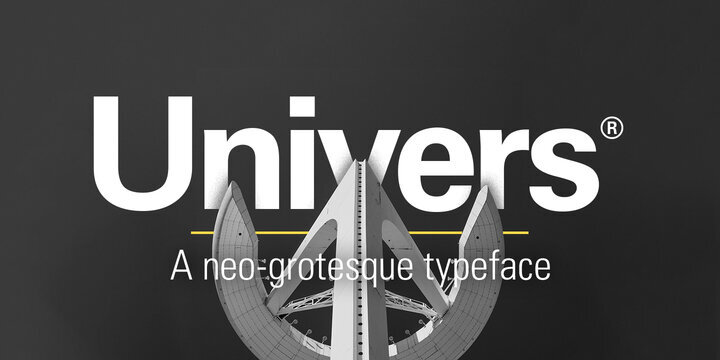
Timeless
Timeless brands are classic. Their designs are able to stand the test of time, because they aren’t hopping onto the latest trends. These brands never go out of style.
Our Picks
Playfair

Gills
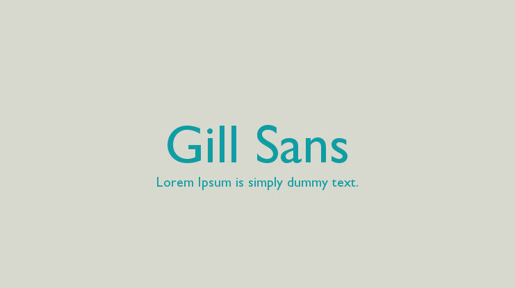
Univers
Our example….well, us. Our logo is in Playfair. We don’t do trendy.
***Color Theory Bonus: Grey is the ultimate neutral. It’ll never go out of style.