THE RED THREAD BETWEEN YOUR BRAND, YOUR PRODUCT & YOUR PACKAGE DESIGN
You have taken the time to create the perfect product. Your brilliantly crafted idea has taken form—has a face, has a name. And now for the daunting task of what to put the thing in. Sure, it should be functional, thoughtful, and needs to look bitchin’ on a shelf. It should also have your logo, instructions and government-mandated requirements. These are a given. But it should also be a representation of your brand. How are you communicating with potential consumers at first sight? How are you telling your story in the seconds it takes for our eyes to scan the shelf? The success of your product begins with how it stands out above the rest.
A buoy in the ocean.
A candle amongst darkness.
A lone flower amongst weeds.
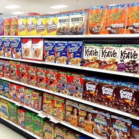
A box of Cinnamon Toast Crunch on shelves and shelves of other cereal boxes.
[Photo: Mike Mozart, Flickr]
First and foremost, it is imperative that you have your brand nailed down or we hate to tell you that not much else of this will matter. Packaging is your frontline brand identifier.
Your packaging must be able to catch an eye, tell a story, and instantly capture your audience. It is your distinguishing factor down to the design, color, and shape. It’s your identity and an extension of your brand that your customer gets to take home and remember you by.
BRAND 1st, PRODUCT 2nd
Your brand is the unique experience you provide. It’s your what you do and why you do it. It needs to build awareness, create an emotional connection, differentiate your product, and motivate your audience to act.
In terms of visual communicating your brand, some of the key elements include:
Positioning & Messaging
Logo
Colors
Typography
Design Elements
Photography
All of these components are key to creating a strong visual identity. It is vital to make sure this identity is consistent when representing your brand, whether that be through logo usage, website design, or packaging.
THINK LIKE YOUR CONSUMER
If your audience is ultimately going to purchase your product, it’s important to get to know them. You must know them from a demographic to a psychographic level. Who are they? How old are they? What do they do? What are their hobbies? What makes them want to buy your product? What makes them want to buy anything?
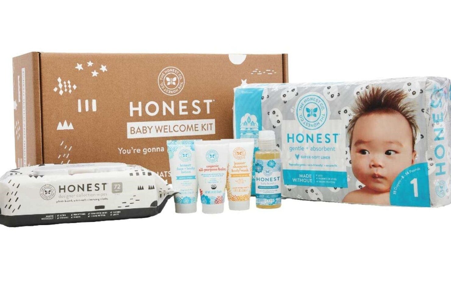
[Photo: The Honest Co.]
Knowing this will help determine the type of design you should be using. Your product’s packaging needs to appeal to your distinct customer archetype. Figure out what is going to grab that customer. For example, if your brand is an organic soap line for kids, think about the mothers your product is targeting. If she is into organic and natural products, think of the sort of package design and colors she might be drawn to while making sure the packaging shows that the product is for kids. The Honest Co. did a bang-up job on that with their baby personal care line.
The Honest Co. is a wellness brand that stands for empowering families to live happy, healthy lives. They target new eco-trendy moms who want safe and sustainable products. Their packaging and product design is a great example of combining a simple and clean aesthetic with the use of color and playful illustration. By comparison, most eco products have green as a predominant brand color and other soaps in this landscape are designed to appeal solely to the child. So, it is super important to keep in mind what your competitors’ packaging looks like. The Honest Co. was able to differentiate itself on the shelf.
The next time you go to the store, take a look at one product type on the shelf. Is there a particular brand that stands out to you? In a world full of red boxes, you want to be the blue box.
We are visual consumers. We see things before we take the time to read them, so it makes sense to say that color affects purchasing decisions. About 75% of consumer reactions are based on color. Color is the most immediate way to not only catch your consumer’s eye but to evoke emotion from them. The colors that you choose to reflect your brand need to be colors that contribute to the feelings you want associated with your brand and product.
DESIGN ELEMENTS
Wait a minute…what’s the budget? There are initial costs as well as costs per item. Packaging is not cheap and you need to determine how much you’re willing to shell out BEFORE you start the process—you’ll thank us for telling you that one day. Once you figure that out, you also need to consider where you’re being sold and how much shelf space you’re getting.
There are some other logistics you need to work out as well. It’s not just boxes. You have the opportunity to get innovative here! You have some options as far as shape and display. Do you want your packaging to show off your product? What kind of material would you like to use? What is the messaging you want to use on your product to inform your audience about you and your product?
There are so many factors to consider when choosing a package design, but it all starts with knowing your brand, knowing your audience, and knowing your budget.
For all of your questions throughout this that might have gone unanswered, we here at Treebird Branding have an answer that is simple. As your creative partner, we are able to transform your brand, not only through design but by crafting the story for your brand to tell. Our vast scope of work stretches way beyond awesome logos and animations, website designs, and killer social campaigns. Learn more about what we do here and take a scroll through some of our package design work below!


