The Ballad of Follies
My husband, Patrick, and I spend a good amount of time on Buford Highway, an Atlanta culinary and cultural goldmine. From foot rubs at Massage Treat Your Feet (not to be confused with Treat Your Feet), clay pot chicken with burnt rice at Chateau Saigon, dim sum at Royal China to the ambiance of Funtime Bowl and the back-wrenchingly heavy ceramic planters at AW pottery, the Buf offers hours of quality entertainment.
Traveling up and down the Buf can be a sensory feast of sorts. Also, look out for that family of six standing in the median! But as a person who spends all her time thinking about logos, fonts, and colors, Buford Highway is pretty much a graphic cesspool. With one beautiful exception...
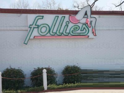
I squeal with delight when we drive by Follies, much to Patrick's chagrin. Their logo is my local favorite for so many reasons. But before I dive in, I do want to note that I haven't actually been inside of Follies, so my experience of their brand is only on the outside. It's not that I'm a prude, but when it comes to Follies, I don't want the reality of whatever lies inside to cloud my admiration of what is one of the top logos in all of Atlanta.
Ok, let's get into why this logo is so glorious by starting with some Logo 101. Let's look at it again!
Below are the 5 principles of design from justcreative.com with notes from me about the utter perfection of the Follies logo.
1. Simple: A simple logo design allows for easy recognition and allows the logo to be versatile & memorable. Good logos feature something unique without being overdrawn.
So this one is obvious for me. Look at the simple sophistication of the Follies logo. The simple lines, no fussy textures or gradients. Score 1 for Follies.
2. Memorable: Following closely behind the principle of simplicity, is that of memorability. An effective logo design should be memorable and this is achieved by having a simple, yet, appropriate logo.
Ok, so the Follies logo is literally a butt with legs. Who could forget that?
3. Timeless: An effective logo should be timeless – that is, it will endure the ages. Will the logo still be effective in 10, 20, 50 years?
Now Follies, like any respectable lady, isn't going to announce how old she is for all the internet to know. So let's go with a reasonable estimate of 25, no, 35 years. 35 years! What a triumph! The vintage font and classic complementary color paring of pink and mint make this logo one for the ages. The calculated restraint their logo designer, bless his or her vision, employed is to be commended.
4. Versatile: An effective logo should be able to work across a variety of mediums and applications. The logo should be functional. For this reason a logo should be designed in vector format, to ensure that it can be scaled to any size. The logo should be able to work both in horizontal and vertical formats.
Ask yourself; is a logo still effective if:
Printed in one colour?
Printed on the something the size of a postage stamp?
Printed on something as large as a billboard?
Printed in reverse (ie. light logo on dark background)
Well here's the Follies logo at night, so I think we can all agree to its versatility.
5. Appropriate: How you position the logo should be appropriate for its intended purpose. For example, if you are designing a logo for children’s toys store, it would be appropriate to use a childish font & colour scheme. This would not be so appropriate for a law firm.
It is also important to state that that a logo doesn’t need to show what a business sells or offers as a service. ie. Car logos don’t need to show cars, computer logos don’t need to show computers. The Harley Davidson logo isn’t a motorcycle, nor is the Nokia logo a mobile phone. A logo is purely for identification.
If a bodyless butt and legs aren't appropriate for a strip club, I don't know what is.
We salute you, Follies. And we'll probably be seeing you this weekend--from the road, of course.

