Logo No Nos: How To Correctly Use Your Logo
So you just received a shiny new logo…now what?
It can be a daunting task trying to master the art of how to use your logo and which files you should be using.
But as the primary visual of your business, your logo should be used properly to best represent your brand. If you worked with a graphic designer or an agency, you might’ve received a brand guide to help you with best practices and show ways to avoid misuse. Your logo will end up being used in so many different ways and in many different sizes (think: social media profile photos, business cards, stationary…the list could go on forever).
It needs to act like a perfectly versatile accessory, so it can work wherever you need it to.
You don’t want to run the risk of a potential customer seeing your logo squished onto an event flyer, barely legible, or stretched out and blurry on an Instagram post. It comes across as unprofessional and goes against the integrity of the brand.
We like to walk our clients through ‘Do’s and Don’ts’ to help illustrate how to correctly use their logo to maintain brand consistency.
Our Do’s
DO use your main logo on all print material, websites, etc. You’ll only want to use your logo alternates (if you have them) when your primary will not fit.
DO use brand-appropriate color options when you have a dark background.
DO always leave a good amount of space around your logo to give it its proper attention.
DO use black and white options when color logos not an option.
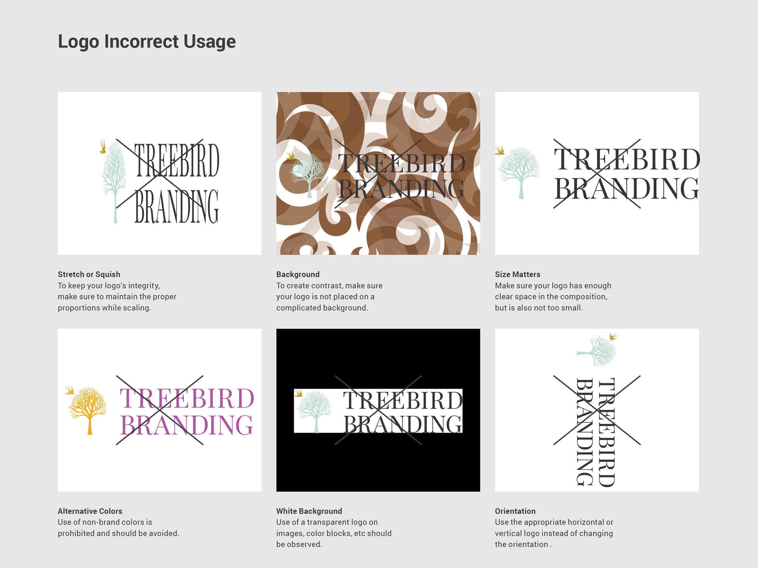
Our Don’ts
DON’T stretch or squish to make it fit. Keep your logo within its proper proportions. Your logo will have to be scaled to be illustrated correctly.
DON’T put your logo on complicated backgrounds. Contrast is key to make it stand out.
DON’T forget the clear space. You don’t want to sell your design short but cutting it off or even by making it too small.
DON’T change your logo colors for a temporary situation. This is why you have a color palette to follow and adhere too. Your brand colors are emotionally linked to your brand and what will your audience will recognize and respond to.
DON’T use your logo with a white background behind it. Use the transparent version for your logo to look its best on photos, color blocks, etc.
DON’T change your logo’s orientation. Make sure you have a horizontal and vertical option to use when necessary.
to maintain integrity in your brand and promote consistency, it’s important to follow these guidelines as closely as possible. your brand is who you are. everywhere your logo is used for your business should be the best reflection of you.